Skip to content

Posts tagged ‘David Queensberry’

Midwinter Kismet

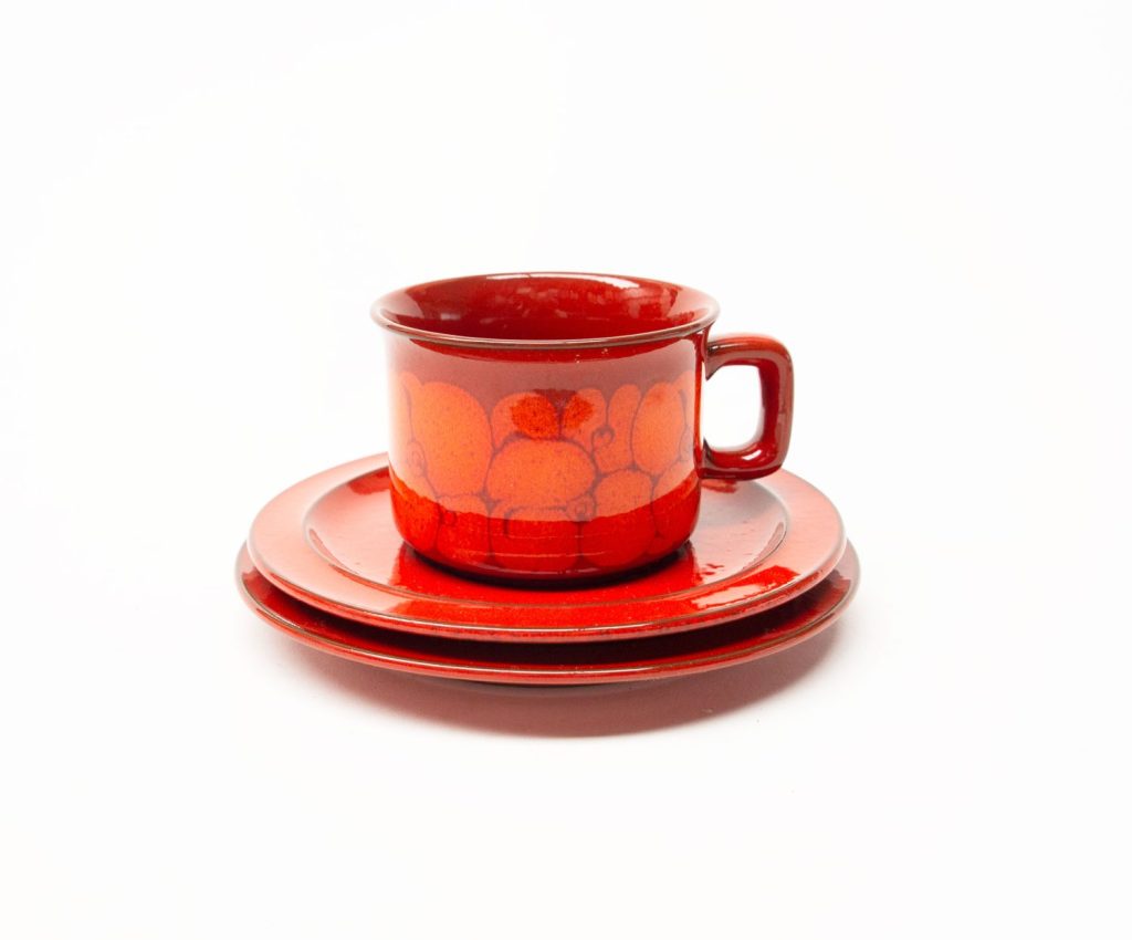
The very impressive decorative pattern on this Midwinter trio is “Kismet”, in production from 1968-1974. The design reflects so well the time in which it was designed – the late 1960s. This was a time of interest in all things Indian, spirituality, batik, psychedelia and The Beatles – amongst other things. It is such a joyful pattern.

The pattern was designed by Joti Bhowmik, who also designed a variation of this design in blue, purple, green and mustard called “Bengal” which was in production from 1968-1970. I haven’t been able to find out any more about Joti Bhowmik unfortunately, and cant find any other patterns them other than Kismet and Bengal.

The forms on which the designs appear are of course the very popular “fine shape” which was designed by the Marquis (David) Queensberry and Roy Midwinter in 1962, and introduced to the market a much stronger and durable ceramic with brighter colours, on a simpler and more modern, functional and streamlined profile.

Midwinter Kismet

Midwinter Kismet


Midwinter Kismet

Midwinter Kismet

Midwinter Kismet

Midwinter Kismet

Read more

Midwinter Queensberry

Midwinter “Queensberry” was the first a series of very popular striped patterns introduced by Midwinter (and many other manufacturers) in the early 1960s. It was in production 1962-1978 on the “Fine” Shape.

As suggested by the name, the pattern was designed by the Marquis (David) Queensberry – who also designed the forms of this series along with Roy Midwinter.

The design of Queensberry had smaller rims than other designs in this series, but was otherwise the same. Features of the Fine Shape series included stackable items and dual function pieces on straight sided forms.

The design consists of stripes of varying widths in olive, yellow ochre, grey and black.

The design reminds me of lines drawn with oil pastels or crayon – and works so well on these “Fine Series” forms. Although a transfer printed design, it has the appearance of being hand painted.

Midwinter Queensberry

Midwinter Queensberry

Midwinter Queensberry

Midwinter Queensberry

Read more

Hornsea Lancaster Vitramic Contrast

Hornsea Pottery, Lancaster Vitramic “Contrast” has become a British design icon. It won the British Design Council awards for design in the 1970s. It features a stunning chocolate velvety matt brown glaze with a black gloss band and bright white interior. The forms are simple, elegant and beautiful – they remind me of the purity of the forms of Denby Chevron with its clean, elegant lines and forms.

A brief history of the design:

In 1972, after years of compromise by adapting and adding to their first factory, Hornsea Pottery needed to expand due to its success. A new (second) site was found and the official opening took place in 1976. The first three ranges produced at the Lancaster factory received Design Council Awards and with them Hornsea Pottery enhanced its already worldwide reputation.

Hornsea Pottery had marked its silver jubilee in 1974 by launching a celebration range of products and this led to a collaboration with Lord David Queensberry and Martin Hunt. Together, in 1974, they produced a very successful range of “Lancaster Vitramic” tableware designs, starting with Contrast. Read more