I havent posted a new article to this site in ages, although I have been maintaining and updating posts in the background with new information as I come across it.
This new post I couldn’t resist though – It has always been one of my favourite Denby designs, but until recently hadn’t actually had a piece in real life.
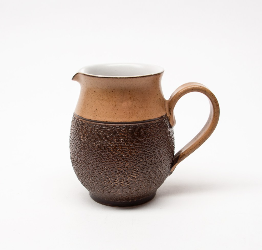
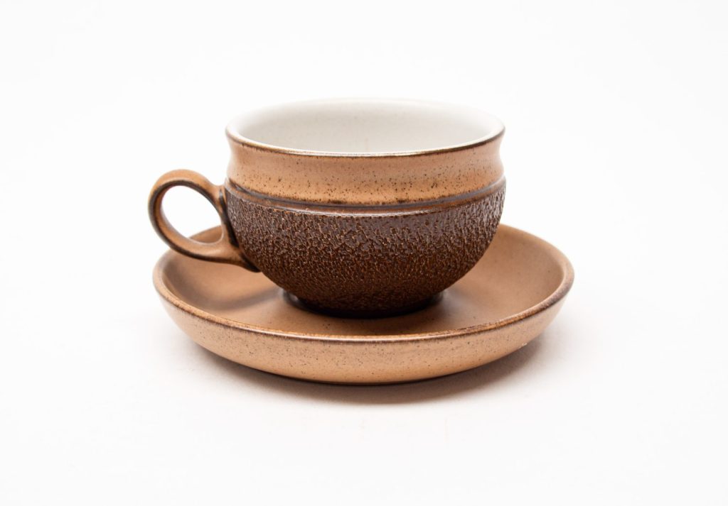
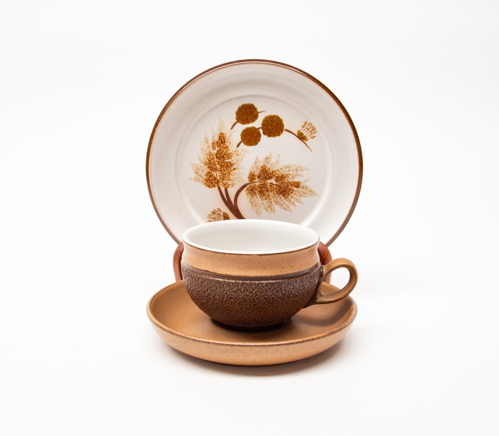
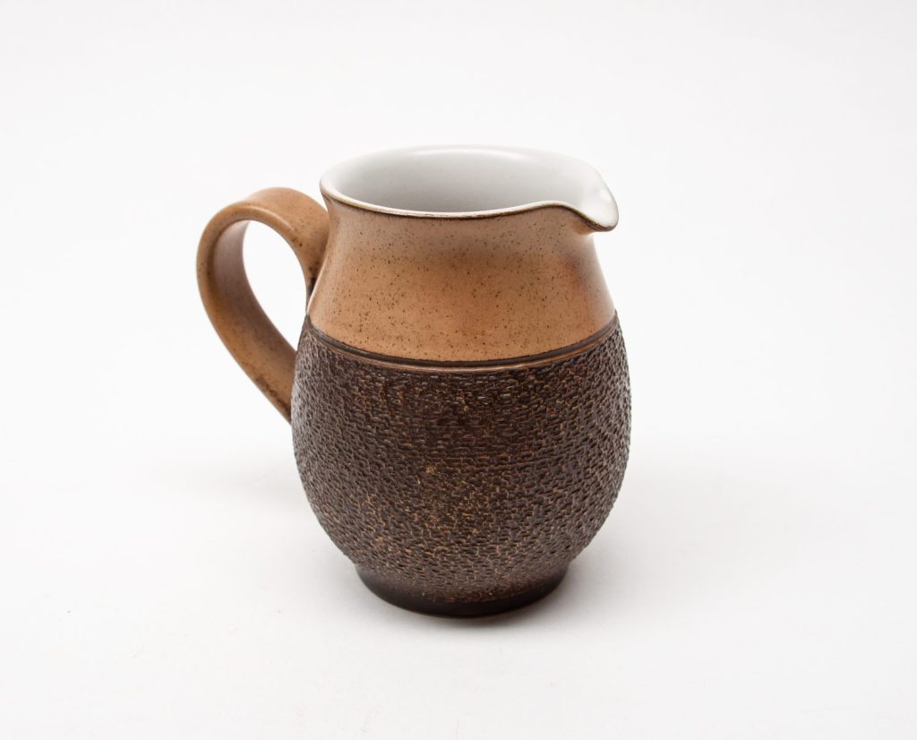
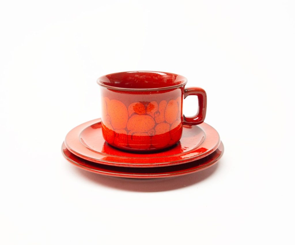
The design is Cotswold and was part of a series designed by Glyn Colledge in 1973 and in production until 1982. The series was “The Country Fayre Collection” and consisted of Sable, Chiltern And Costwold.
Cotswold holloware has the most wonderful hand textured dark brown exterior (which Ive seen described as either “bark” or “avocado skin”) combined with a subtly iron speckled satin gloss warm brown glaze. Inside the hollow ware pieces is a contrasting satin white glaze. The flatware has a freely hand-painted floral spray in light browns and ochres on the satin white glaze.
The pieces such as the cups, jugs etc would have been hand thrown and decorated and the flat pieces jiggered or jollied as was the Denby production process for dinnerware in this era.
As with all Denby from this era, it is stoneware, tough as nails, lasts for decades, and from a time when Denby Pottery (and most other pottery production) was led by good design, and skilled designers.
Denby Cotswold Jug – Design by Glyn Colledge 1973 Denby Cotswold 1973, Glyn Colledge Designer Denby Cotswold Trio- Design by Glyn Colledge 1973Denby Cotswold Jug – Design by Glyn Colledge 1973
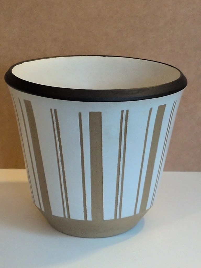
NOTE: there is also an earlier and different Denby “Cotswold” designed by Kenneth Clark in 1956 using the shapes of the Gourmet range, with a satin white glaze and bold sgraffito decoration to the underlying clay body. It seems incredibly rare now and I have yet to spot a piece in real life.
Denby Cotswold Vesion 1, Designed by Kenneth Clark 1956 – Image via eBay
It would be hard to find design that screams 1970s than this bold and colourful design. It has influences of Pop-Art, Psychedelic Art and the bold and colourful Graphic Design of this era. The design consists of black silhouetted trees set against an op-art style dot pattern sky in white on purple with rolling hills in green, orange and ochres. These colours (and the style of graphic) defined the look of so much design in the 1970s.
Denby Trees 1970.
This article was originally published a few years ago, but the wordpress file was corrupted and it couldn’t be viewed, so here it is refreshed in all its wonderful colour, with some additional information.
It would be hard to find design that screams 1970s than this bold and colourful design. It has influences of Pop-Art, Psychedelic Art and the bold and colourful Graphic Design of this era. The design consists of black silhouetted trees set against an op-art style dot pattern sky in white on purple with rolling hills in green, orange and ochres. These colours (and the style of graphic) defined the look of so much design in the 1970s.
It was only in production for 1 year as far as I can make out, making it a very scarce design to find now.
Denby Trees – Photo Ray Garrod
The shapes the design is placed on you may recognise immediately as the forms Gill Pemberton designed for “Chevron” in the 1960s. The “Trees” design was placed on all of the forms of Chevron including the steel handled teapot, coffee pots, lidded forms, bowls, plates and dishes.
Denby Trees – Image via H is for HomeDenby Trees
The design of Trees is by Diana Woodcock-Beckering who was trained at the Croydon College of Art and Design in 1962, which led to a Diploma at Loughborough College, before post graduate MA qualifications at the Royal College of Art, London starting in 1966.
Denby Trees – Photographer/Origin unknown
Diana worked at Denby between 1969-1971, and after leaving Denby, Diana (now Diana Worthy) went on to set up Crich Pottery in Derbyshire in 1972 with her husband.
There is so much to Diana than her “Trees” design for Denby though.
I found a very thorough and well written 2001 article on the studio work of Diana HERE , which also has a good variety of images clearly showing the style Diana developed. Diana’s achievements during her study and post graduate study were quite stellar – from the article linked is this quote:
“Diana could usually be found in college (Royal College of Art) at all hours, seven days a week. There she met Hans Coper, David Queensberry and Eduardo Paulozzi. Diana won the RCA prize for drawing and also the Frank Denning Memorial Award to study designs in Scandinavia. Her final degree show M (Design) RCA resulted in offers of freelance pottery designing for Kilkenny Design workshops and for Denby Pottery in Derbyshire. She also took a full time lecturing post at Wolverhampton Polytechnic in the Faculty of three-dimensional design”
I found this charming piece from Crich Pottery by Diana, where the tree theme is used again on a handmade stoneware bottle form, to a different but equally resolved effect. You will find many more examples like this just by typing “Crich Pottery” into a search engine images.
Crich Pottery Bottle
Diana and her husband closed Crick Pottery in 2004 after 30 successful years there, and re-located to Spain where Diana now works with Textiles (information sourced from her website HERE) . Diana also has a Facebook page here
OR If Etsy is unavailable, or you would prefer eBay - follow the link below (click on the image) . Basically the same items are listed, at the same price.