Skip to content

Arabia Finland, Anemone and Rosmarin

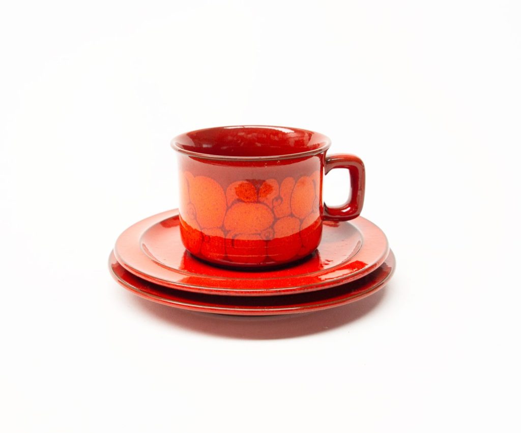
Arabia Finland designs Anemone and Rosmarin were patterns designed by Ulla Procope, both around the same time. I see variations between the exact dates, but both appeared to have been in production c1962 to c1976. I have seen Anemone described as being in production until 1993, but only from 1 source.

The designs are on the same “S” shape series of forms as was “Ruska” and several other designs.

I find it fascinating how just a single colour can transform the appearance and often monetary value of otherwise the same object. Perhaps it has something to do with changing tastes. The brown reddish iron oxide of Rosmarin might remind too many people of the 1970s or 1980s whereas the blue of Anemone seems more timeless.

Anemone tends to bring much higher prices on the resale market than Rosmarin.

The pattern is the same, and forms are the same – its only the colour that is different. This colour though changes the appearance of how the design ‘sits’ on the surface, in addition to the human eye often having a preference for blue colours over brown.

There are also more variations in intensity of colour in Rosmarin than in Anemone – the strength of the iron in the colour can vary from an almost wash-like appearance on some pieces of Rosmarin, to a wide range of dark and light iron oxide hues on other pieces. Anemone doesn’t seem to have quite the same variations.

It may also have something to do with the chemical difference between the 2 oxides – cobalt for Anemone, and iron for Rosmarin. Regardless though, I find it all quite interesting how colour can transform the same object.

Arabia Finland Anemone

Arabia Finland Anemone

Arabia Finland Rosmarin

Arabia Finland Rosmarin


Arabia Finland Anemone

Arabia Finland Anemone

Arabia Finland Rosmarin

Arabia Finland Rosmarin

Read more

Denby Studio 1960s

This impressive looking series called “Studio” was released by Denby c1961 as a dinnerware set with a number accessories or decor items.

It seems pretty uncommon these days, except for some reason the accessories like jugs, small vases etc. which seem to pop up reasonably often.

The forms for this series were designed by Kenneth Clark who also designed the Gourmet range – and this shape was also used for Ode and Echo (a blue version of Ode).

 Kenneth Clark (1922 -2012)

“Took a domestic product that had become boring in its ubiquity and transformed it with technical knowledge and design flair into a vehicle of delight and usefulness. His designs honoured the traditions of studio pottery while incorporating the technical innovations of commercial potteries”

The glaze on studio is a beautiful speckled soft glossy grey with soft edged dark brown vertical lines. Inside the glaze is a glossy cream colour. The glaze would probably have been designed by either Albert or Glynn Colledge.

Denby Studio Tall Jug//Vase

Denby Studio Tall Jug//Vase

Denby Studio Cups – image via MotherMust Etsy

Denby Studio Jug

Denby Studio Jug – via ebay

Read more

Midwinter Berkeley

Midwinter Berkeley is a design by Jessie Tait for Midwinter, produced 1969-1974. It is quite a rare design these days. The pattern was produced on the “Fine Shape” Series which Midwinter started in 1962.

The design consists of a band of squares in alternating olive and turquoise, with an alternating centre colour.

The design to me reflects the influence of colour theorist Joseph Albers....who’s work significantly influenced 20th Century Art & Design – including “Op Art”  popular in art, design and culture at the time – and especially big in Britain and Germany.

Midwinter Berkeley

Midwinter Berkeley

Read more