Skip to content

Some More Charming Figgjo Designs

For those reading this website, who don’t often have a look at my Etsy store, it is worthwhile doing so from time to time, as there are often items for sale there which aren’t written about on this site. The link to the store is on the picture in the right hand column or HERE

Recently I listed this gorgeous, very large “Saga” design ceramic board. It is one of my favourite Turi Gramstad Oliver designs – and always reminds me of “Camelot” – possibly something to do with the time in which Turi designed this – 1964, but also the medieval look of some of the costumes the characters are wearing in the different variations of the design.

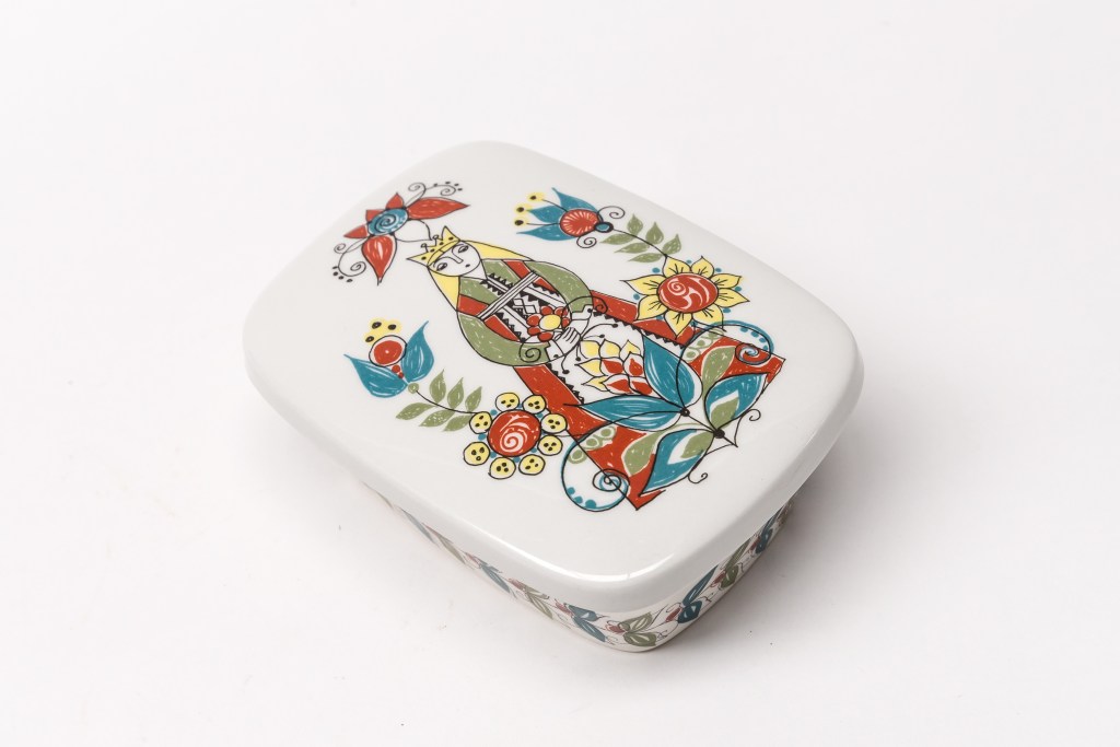
Figgjo “Saga” – Turi Gramstad Oliver 1964
Figgjo “Saga” Lidded Butter Box (sold)

Another of my favourite designs from this era by Turi is “Mons og Mille”, designed in 1963.
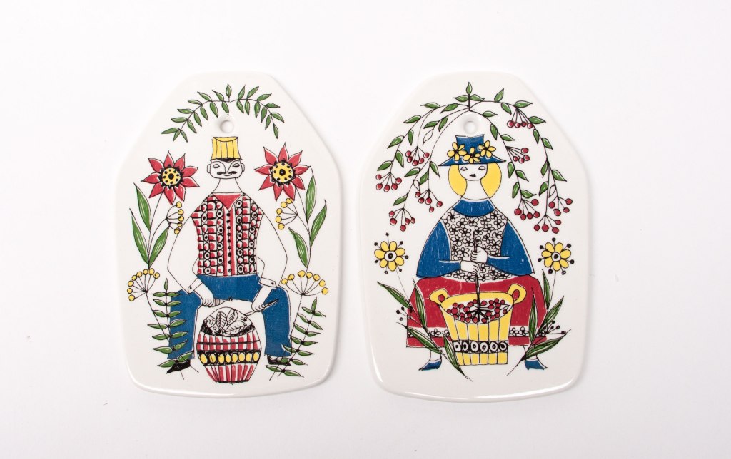
Mons og Mille Wall Boards, Turi Gramstad Oliver 1963.

….and the lovely very large board from the same series:
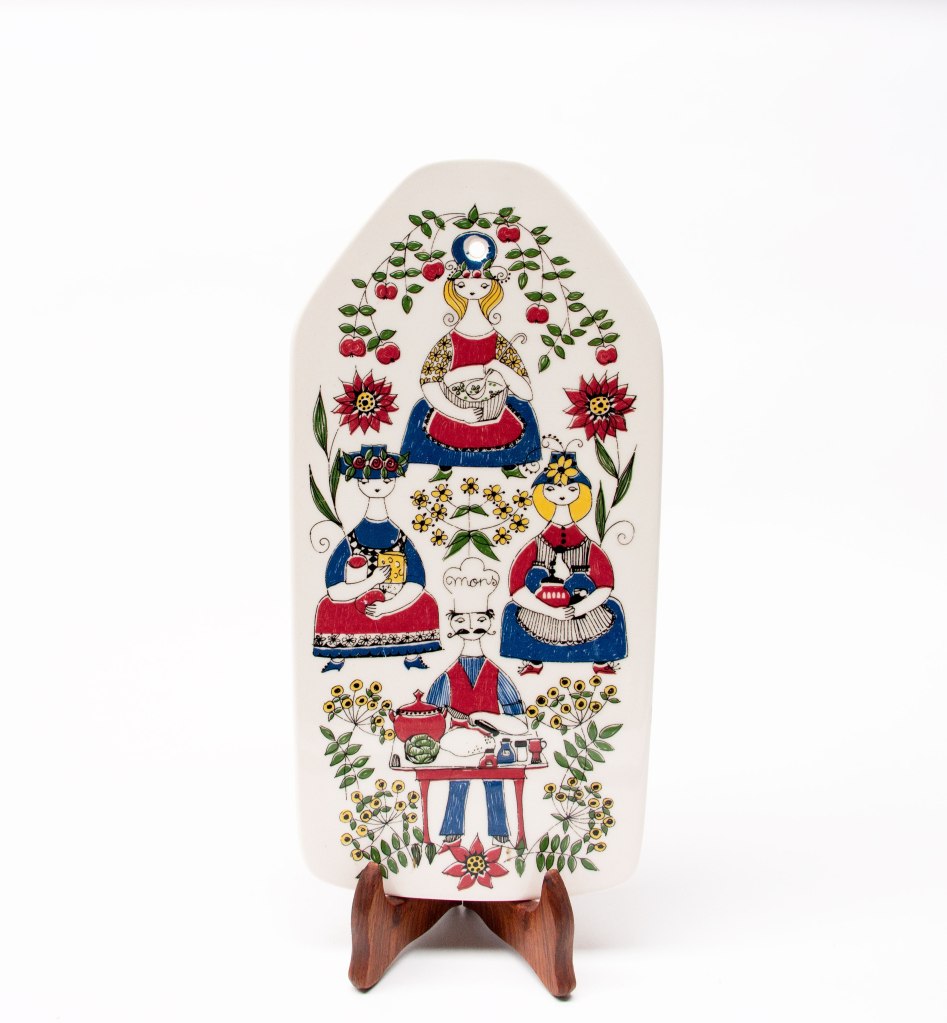
Figgjo Mons og Mille, Turi Gramstad Oliver

All of these ceramic boards were designed to serve food such as open sandwiches, cheese, etc. and had a built in hole at the top to hang on the wall, and decorate the kitchen when not in use. Also a good way of not having them break by storing flat in a cupboard.
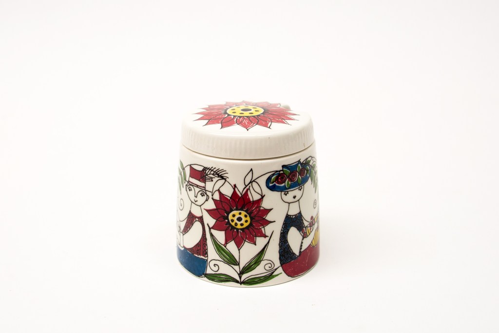
Figgjo Mons og Mille, Lidded conserve Jar (SOLD)

Then there is this charming design of “cats in a tree” called “Mons” . This now iconic design by Turi Gramstad Oliver was released in 1975. It was designed as part of children’s set and has been a classic in kindergartens, hospitals, and homes ever since its release in 1975 – a very collectable pattern amongst collectors or Turi’s designs – and not often seen outside of Norway from what I can see.
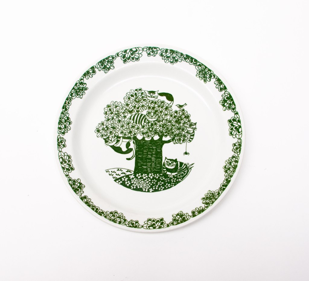
Figgjo Mons – Turi Gramstad Oliver 1975.

..and finally I have just listed on Etsy 2 skillet pans in the “Needlepoint” pattern. I have not been able to find anything about this design or who designed it. It seems to be quite rare which probably indicates a short production run. To me it doesn’t appear to be one by Turi Gramstad Oliver…but I could be wrong of course.
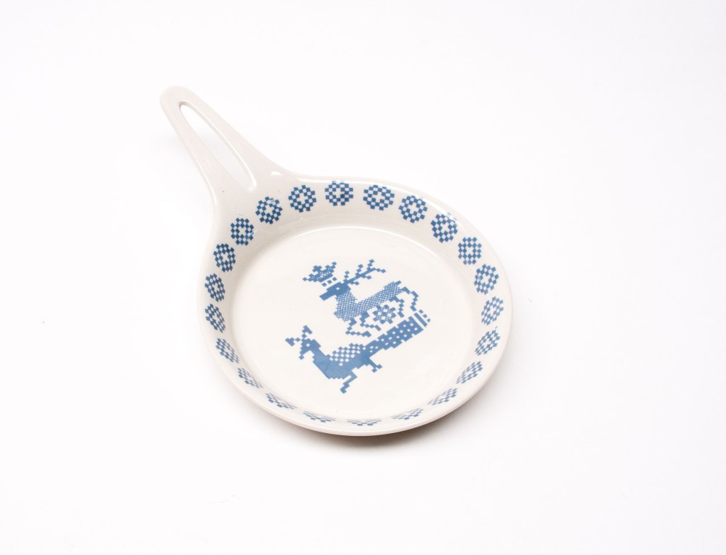
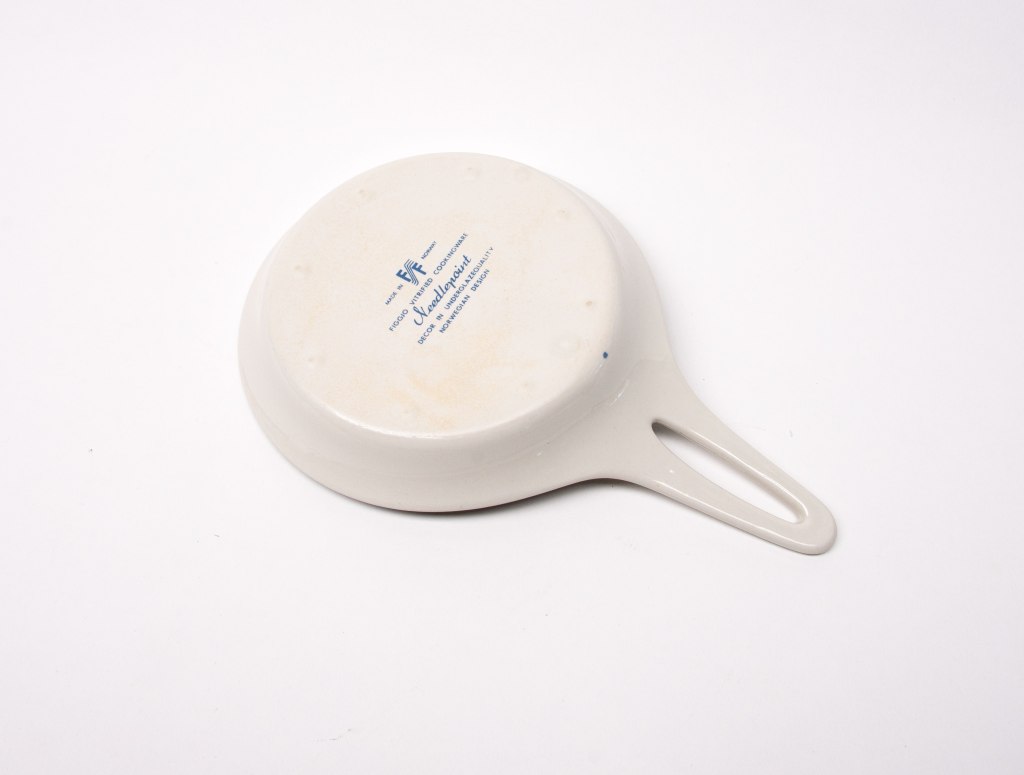
Figgjo Norway “Needlepoint” Design

Denby Trees

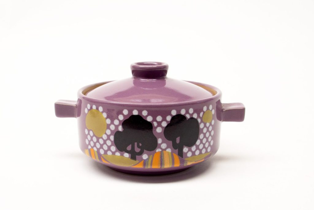
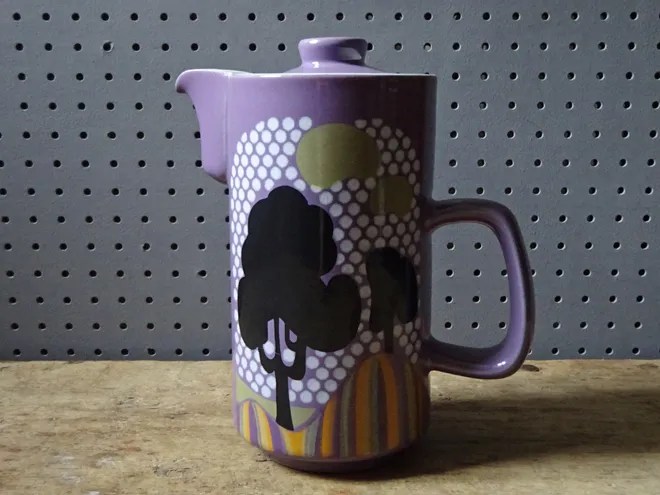
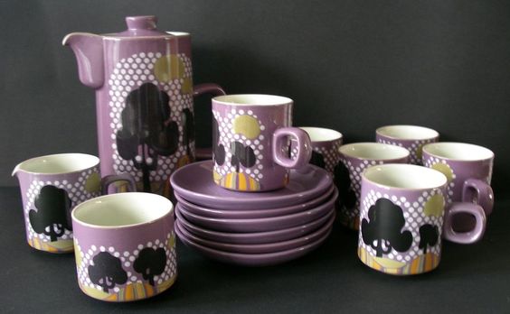
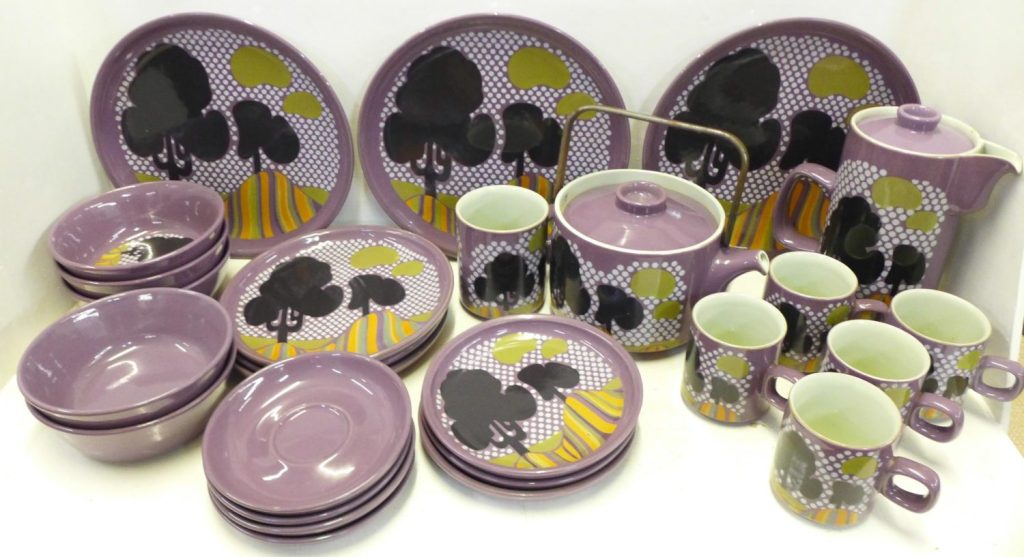
It would be hard to find design that screams 1970s than this bold and colourful design. It has influences of Pop-Art, Psychedelic Art and the bold and colourful Graphic Design of this era. The design consists of black silhouetted trees set against an op-art style dot pattern sky in white on purple with rolling hills in green, orange and ochres. These colours (and the style of graphic) defined the look of so much design in the 1970s. 

Denby Trees 1970.

This article was originally published a few years ago, but the wordpress file was corrupted and it couldn’t be viewed, so here it is refreshed in all its wonderful colour, with some additional information.

It would be hard to find design that screams 1970s than this bold and colourful design. It has influences of Pop-Art, Psychedelic Art and the bold and colourful Graphic Design of this era. The design consists of black silhouetted trees set against an op-art style dot pattern sky in white on purple with rolling hills in green, orange and ochres. These colours (and the style of graphic) defined the look of so much design in the 1970s. 

It was only in production for 1 year as far as I can make out, making it a very scarce design to find now.

Denby Trees
Denby Trees – Photo Ray Garrod

The shapes the design is placed on you may recognise immediately as the forms Gill Pemberton designed for “Chevron” in the 1960s. The “Trees” design was placed on all of the forms of Chevron including the steel handled teapot, coffee pots, lidded forms, bowls, plates and dishes. 

Denby Trees – Image via H is for Home
Denby Trees
Denby Trees

The design of Trees is by Diana Woodcock-Beckering who was trained at the Croydon College of Art and Design in 1962, which led to a Diploma at Loughborough College, before post graduate MA qualifications at the Royal College of Art, London starting in 1966.

Denby Trees
Denby Trees – Photographer/Origin unknown

Diana worked at Denby between 1969-1971, and after leaving Denby, Diana (now Diana Worthy) went on to set up Crich Pottery in Derbyshire in 1972 with her husband. 

There is so much to Diana than her “Trees” design for Denby though.

I found a very thorough and well written 2001 article on the studio work of Diana HERE , which also has a good variety of images clearly showing the style Diana developed. Diana’s achievements during her study and post graduate study were quite stellar – from the article linked is this quote: 

“Diana could usually be found in college (Royal College of Art) at all hours, seven days a week. There she met Hans Coper, David Queensberry and Eduardo Paulozzi. Diana won the RCA prize for drawing and also the Frank Denning Memorial Award to study designs in Scandinavia. Her final degree show M (Design) RCA resulted in offers of freelance pottery designing for Kilkenny Design workshops and for Denby Pottery in Derbyshire. She also took a full time lecturing post at Wolverhampton Polytechnic in the Faculty of three-dimensional design” 

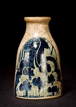
I found this charming piece from Crich Pottery by Diana, where the tree theme is used again on a handmade stoneware bottle form, to a different but equally resolved effect. You will find many more examples like this just by typing “Crich Pottery” into a search engine images. 

Crich Pottery Bottle

Diana and her husband closed Crick Pottery in 2004 after 30 successful years there, and re-located to Spain where Diana now works with Textiles (information sourced from her website HERE) . Diana also has a Facebook page here

Turi Gramstad Oliver – The Book!

I was delighted to find out about this recently released book on the work and life of Turi Gramstad Oliver, …and what a book to behold. 360 Pages of mesmerising beauty written by Torunn Larsen and designed by trykkSAK forlag

It is at the same time beautiful to look at, as well as a comprehensive, superbly edited and illustrated volume which is near impossible to put down. It is a book I will be coming back to time after time.

From the book designers:

Turi Gramstad Oliver is the woman behind the world famous Turi-design. This book gives a unique insight into both her personal life and lifelong artisanship. It displays Turi’s broad range of work; from her porcelain designs for Figgjo, to her work with textiles and handmade paper. Written by Torunn Larsen, this book includes over 500 illustrations and pictures from Turi’s personal archive’

The book is breathtaking in its scope…..starting with Turi’s childhood, and how her interest in drawing and ceramics started…..then onto her time in England (which I knew little of until reading about it here)….followed by a detailed account of Turi’s time, designs and working relationships at Figgjo – and that is just the first half of the book……

About Turi’s Figgjo designs, Torrun writes:

“These narrative designs form an essential part of Turi’s Figgjo production and exist as glazed monuments to her talent as an illustrator. She balances playful richness with decorative minimalism. She also drew stylised decorative designs with a sharp eye for detail, with the starting point for the patterns often being inspired by nature. The use of colour over the course of 20 years at Figgjo testifies to both the will and capacity to experiment”

The second part of the book explores Turi’s work as an important Fabric and Paper Artist, including more beautiful illustrations and photographs of her work .

The lovely thing about this book is that this is not a dry and academic book, but a fascinating glimpse into the personal and working life of an Artist which will resonate with so many people.

I love this piece of writing near the end of the book

” Turi’s large, gnarled hands bear witness to a long life of manual labour dealing in clay, thread and fibre …as well as food and soil. …….with innovation and a farmer like work ethic, she has built up her artistry, her home, her garden, and her work environment, while refusing to let her work be synonymous with exhaustion and deprivation. Turi’s exuberant zest for life stands in almost comical contrast to the cliche of the suffering artistic genius that has taken up such a prominent place in art history. Her artistic method has been to cultivate, and to share the fruits of a good life, turning to face the sun, while keeping her roots in good soil”

Have a look at the promotional video by the publisher at the end of this post to see more of the book.

The book is in a limited release of 1,500 copies, and can be ordered via the site set up for it HERE. Even with the postage cost all the way to here in Australia, I think this book represents outstanding value for money, and is a treasure trove of information to be found nowhere else.

Turi

trykkSAK #2 from SAK design on Vimeo.