Skip to content

Posts from the ‘United Kingdom’ Category

Royal Doulton “Festival”, Lambeth Stoneware 1974

In 1974, Royal Doulton updated the concept of its original Lambethware stoneware from the turn of the century and created a casual tableware brand called “Lambeth Stoneware” – it was tough, durable, detergent and dishwasher proof and had strong public appeal. Other than the name though, it had no connection to the original Lambeth stoneware which closed in 1956 (and which was very different in nature) 

The new series was well designed with rounded forms and a country style charm which was popular at the time. It is long lasting and as tough as nails like a lot of the stoneware dinnerware series of the time.

There were a large number of patterns released, but I have not been able to locate a list of them – and I continue to be surprised when I come across another charming pattern from the series I haven’t seen before.

Two of the most popular seem to be “Tangiers” and “Basque” (which I have written about previously)…and recently I came across this charming pattern called “Festival”, produced 1975-1979. It features fruits, leaves and berries in blues and violets outlined in navy blue. 

The forms of this series seem to work best when a white glaze is used with a strongly coloured pattern, as in this design. It gives them a more timeless, less dated appearance than ones such as “Basque” with its dark muted tones. 

Royal Doulton Lambeth Stoneware "Festival"

Royal Doulton Lambeth Stoneware “Festival” Milk Jug – Photo Ray Garrod

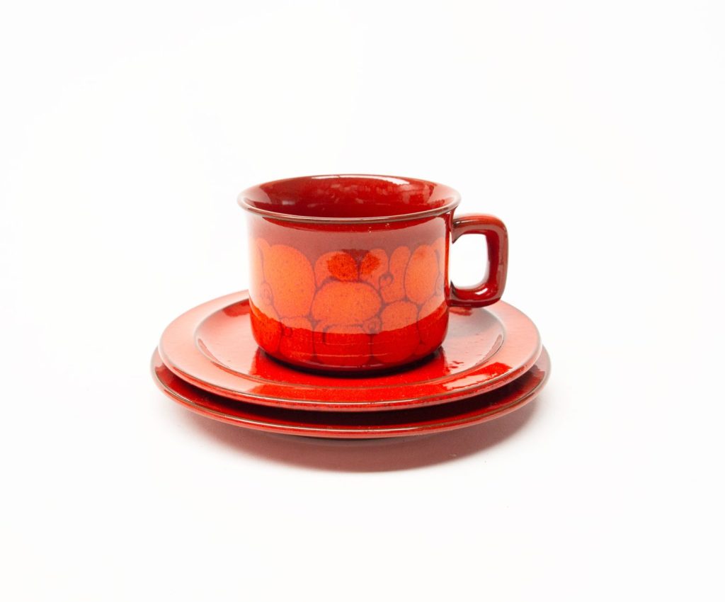
Royal Doulton Lambeth Stoneware "Festival" Cup and Saucer,

Royal Doulton Lambeth Stoneware “Festival” Cup and Saucer, Photo via “Vintageoak” on Etsy

Royal Doulton Lambeth Stoneware "Festival"

Royal Doulton Lambeth Stoneware “Festival” – Lidded Sugar Bowl, Photo Ray Garrod


Ondine Design – Gerald Benney for Ridgway Potteries 1965

Gerald Benney (1930-2008) is well known as a very important 20th Century Silversmith in both the specialist and mass markets where his attractive “bark finish” became a signature style. You can read more about his work in his Obituary in the Guardian HERE. 

His work in Ceramics is less known and documented – and the only confirmed record of ceramics he designed I can find is for Ridgway Potteries in 1965 when he designed the Ridgway “Ondine” series on a form which he also designed, called “Albion”.

There are some other designs which appear to be from his hand, but I am yet to confirm he is the designer.

“Ondine” hits the perfect balance between form and decoration on his very elegant modernist forms – which have a strong Scandinavian influence. Many of Benney’s designs have that Scandinavian look about them – possibly an influence from his early in career work with Norwegian designer Berger Bergersen, and the influence of Georg Jensen designs.

The pattern on his Ondine design makes me think immediately of the tines of his designs for forks – see the image below the teapot. The very smart “Albion” form on which Ondine sits also has similarities to his wonderful silverware coffee set “Elizabeth II” (also pictured below) – specifically the form of the handle and the spout. The “flat” lid and generous handle shape is something he used often on his silverware designs.

I love the simplicity of the Ondine design which is at the same time very sophisticated and elegant – alternating blue and green panels, outlined with a black maze like pattern, wrapped perfectly around the form on which it sits.

The V&A Museum in its online collections has some fabulous examples of Benney’s work, including a fascinating design for a silver coffee pot design very similar in shape to the teapot design pictured here. They also outline how Benney’s now iconic “tree bark” finish was developed:

“His signature textured tree-bark finish was developed by accident. While hand-raising the bowl of a cup he unintentionally used a silver hammer with a damaged head. After hitting the smooth surface of the silver several times with the hammer he created a pleasing ribbed and rippled surface that resembled the bark of a tree. As well as being aesthetically pleasing this textured surface also had a practical advantage; it prevented fingermarks and tarnishing” 

Ridgway Ondine Teapot - Gerald Benney 1965
Ridgway Ondine Teapot – Gerald Benney 1965 – Photo Ray Garrod
Ridgway Ondine Teapot - Gerald Benney 1965
Ridgway Ondine Teapot – Gerald Benney 1965 – Photo Ray Garrod
Ridgway Ondine Tea Cups
Ridgway Ondine Tea Cups photo via Greysgiftsandgarbage Etsy.
Gerald Benney Stainless Steel Forks
Gerald Benney Stainless Steel Forks photo via lemmingsalmon etsy
Gerald Benney ELIZABETH II Coffee Service. Image via Live Auctioneers.
Ridgway Ondine Sauce Boat
Ridgway Ondine Sauce Boat – photo via mrmod.co.nz

Susie Cooper ‘Cornpoppy’

Susie Cooper (1902-1995) was one of the most prolific and talented ceramic designers of the 20th Century….. if not THE top designer of ceramics in the 20th Century. I have several entries on this website with my favourite Susie Cooper patterns.

Susie Cooper’s career spans over 7 decades from when she founded the Susie Cooper Pottery in 1929 until the late 1980s. I’ve never come across a design by her which I don’t admire. I especially like her Art Deco era pieces, but it is also her 1960s and 1970s designs which stand out from the crowd.

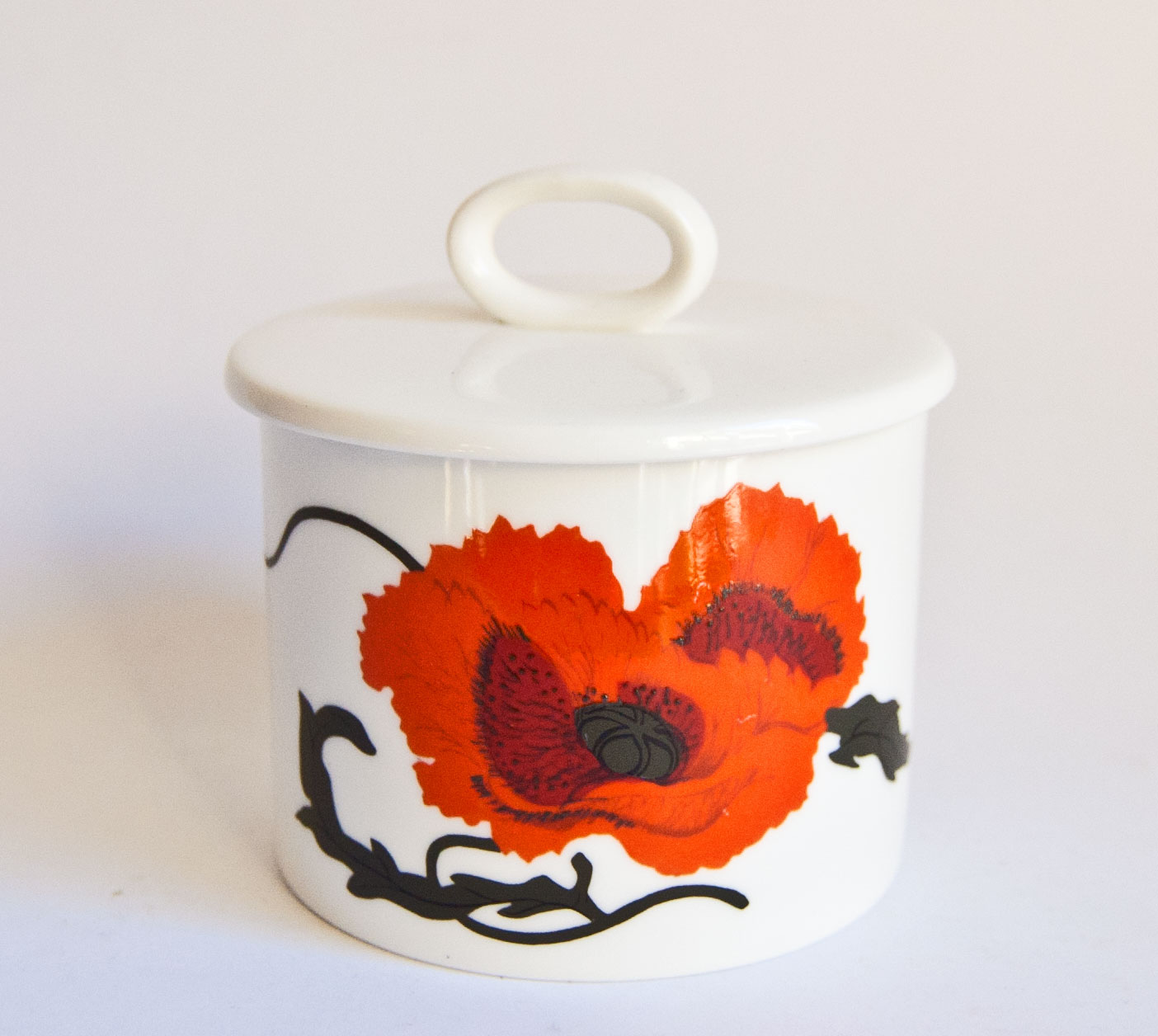
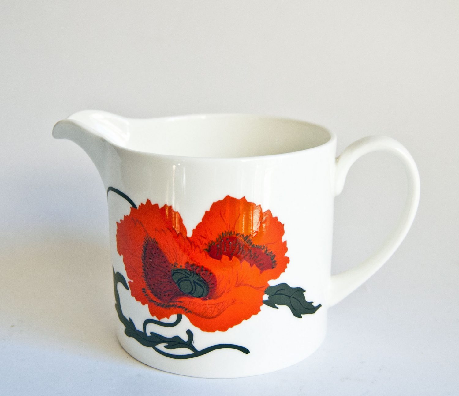
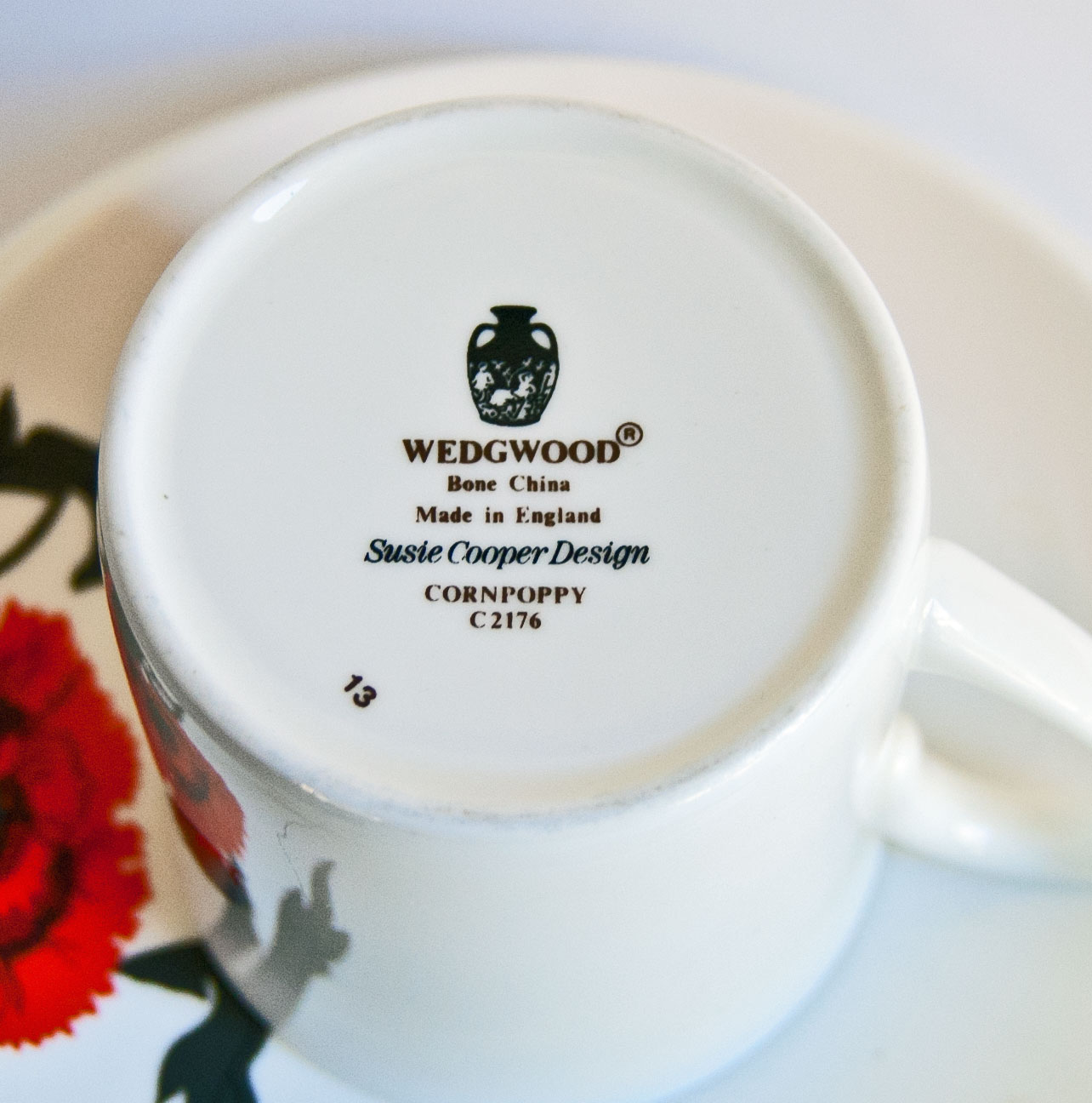
Her patterns are always beautifully balanced, with an exquisite attention to detail which many designers neglect. She also knew the importance of the clay body and form on which the design was put, and stated in the 1950s that “The beauty and translucency of china should speak for itself and not be overburdened by pattern” – I think that this view is demonstrated in one of her stand out 1970s designs – “Cornpoppy” (1971) from her Wedgwood period.

There is a complex depth of colour and texture in the orange and red of the poppy, and the black flowing lines contrasted against the bright white clay body remind me of the beauty of Japanese and Chinese calligraphy.

In the very thoroughly researched and written book “Susie Cooper, A Pioneer of Modern Design” by Andrew Casey & Ann Eatwell, about “Cornpoppy” they write:

“The pattern, almost oriental in the stark contrast between the scarlet poppy and touches of black against the white bone china, demonstrates …her claim that a well designed article of pottery contributes to the interior design of the home. It is impossible not to sense the joy of the artist in this floral motif with its flowing lines and vibrant colour, unrestrained by the rimless coupe shape…..of course Susie Cooper had always been famous for her depiction of flora, but this was quite a departure from the combination of gentle pastel colours and creamy earthenware body of the 1930s. 

Here are a few pieces of Cornpoppy I have had hold of recently:


Susie Cooper Cornpoppy

Susie Cooper Cornpoppy – Photo Ray Garrod

Susie Cooper Cornpoppy

Susie Cooper Cornpoppy – Photo Ray Garrod

Susie Cooper Cornpoppy

Susie Cooper Cornpoppy – Photo Ray Garrod

Susie Cooper Cornpoppy

Susie Cooper Cornpoppy – Photo Ray Garrod

Susie Cooper Cornpoppy

Susie Cooper Cornpoppy – Photo Ray Garrod