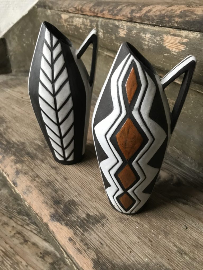
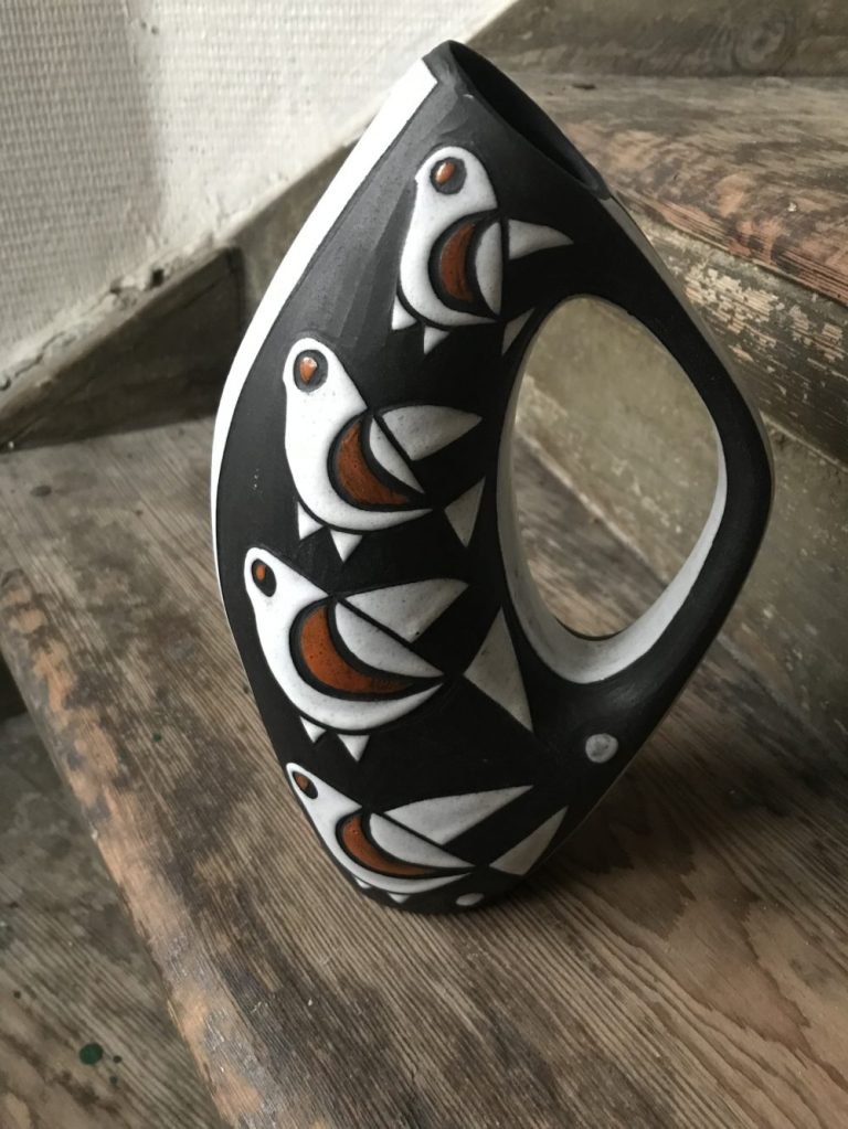
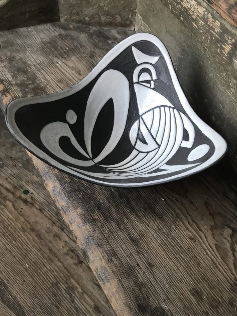
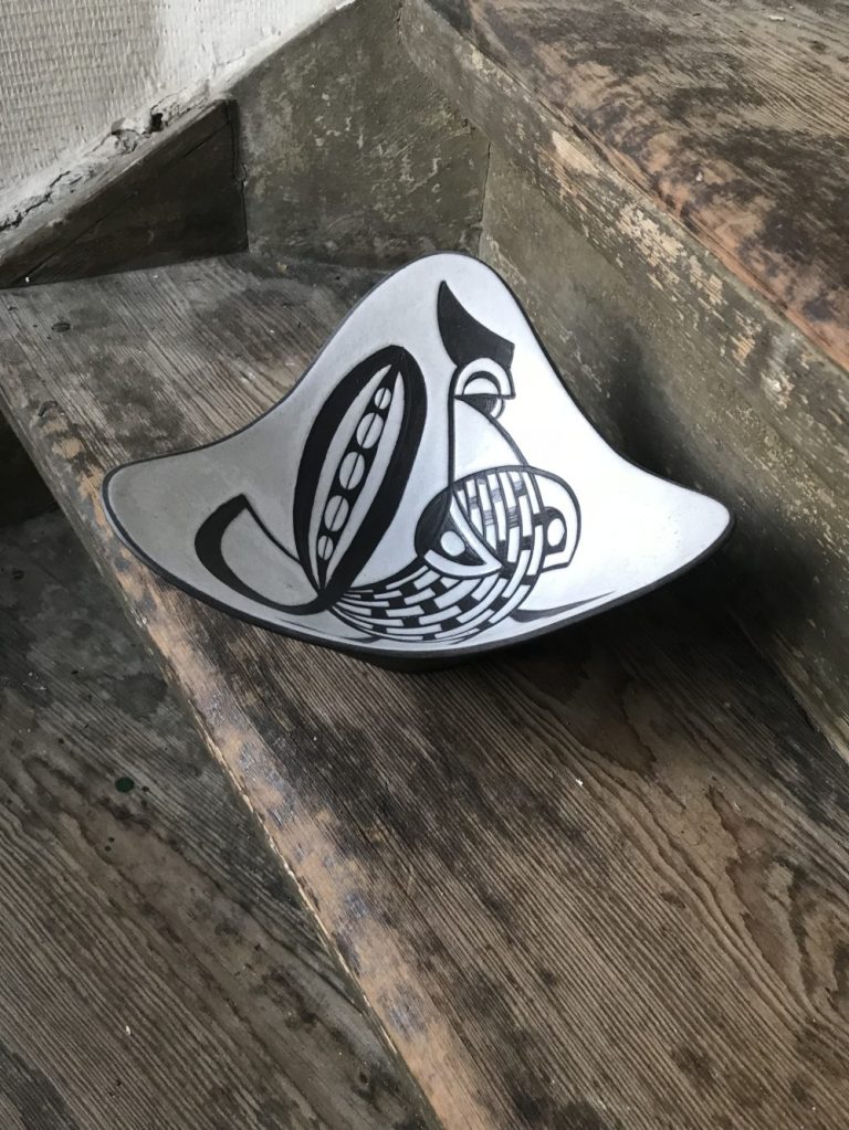
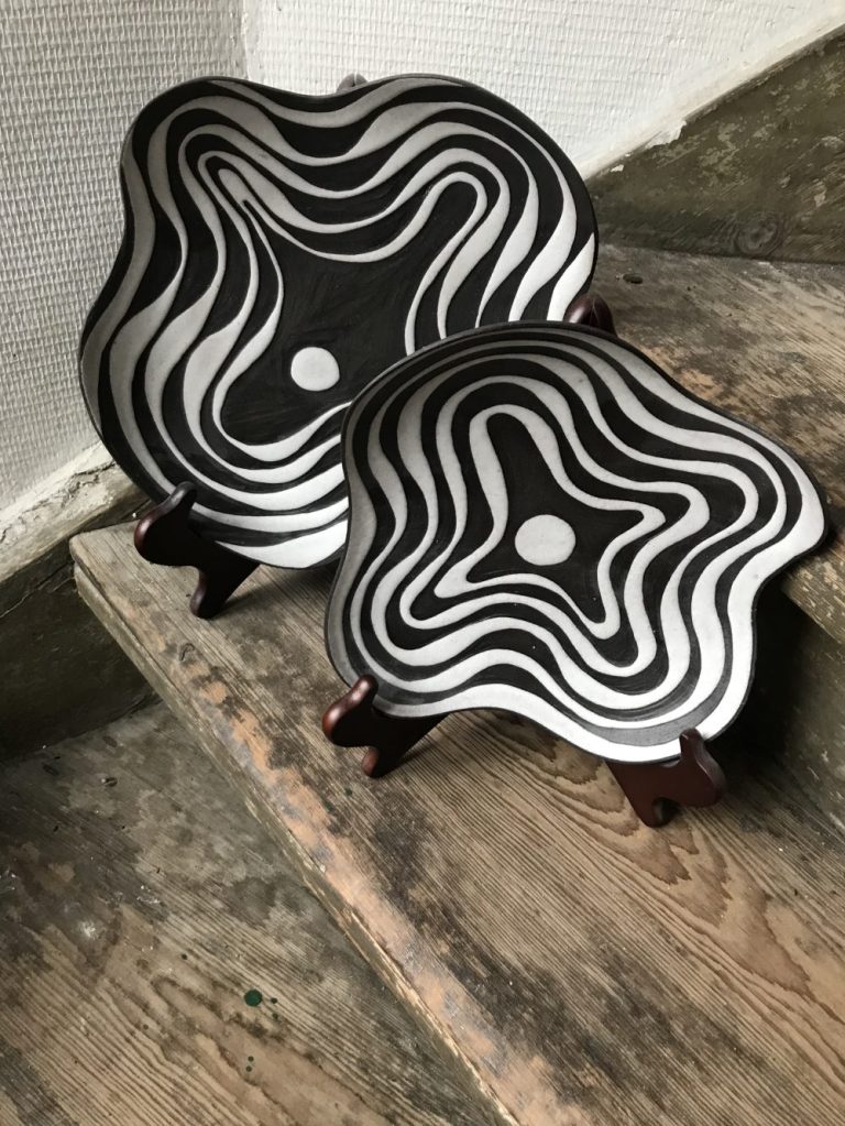
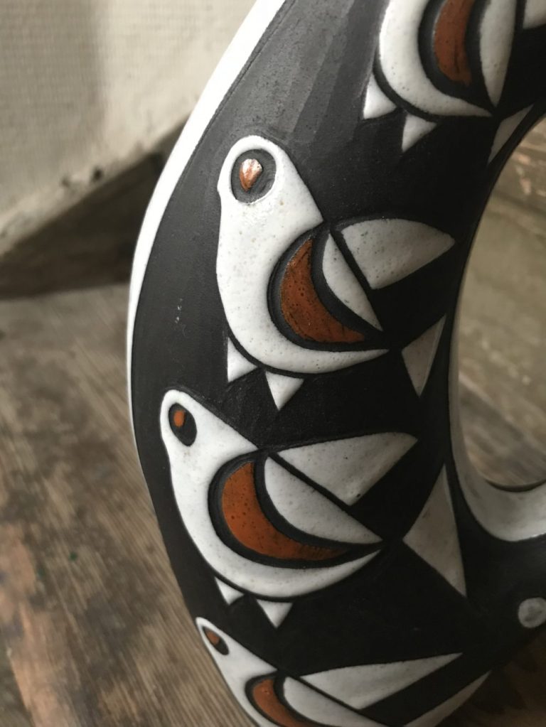
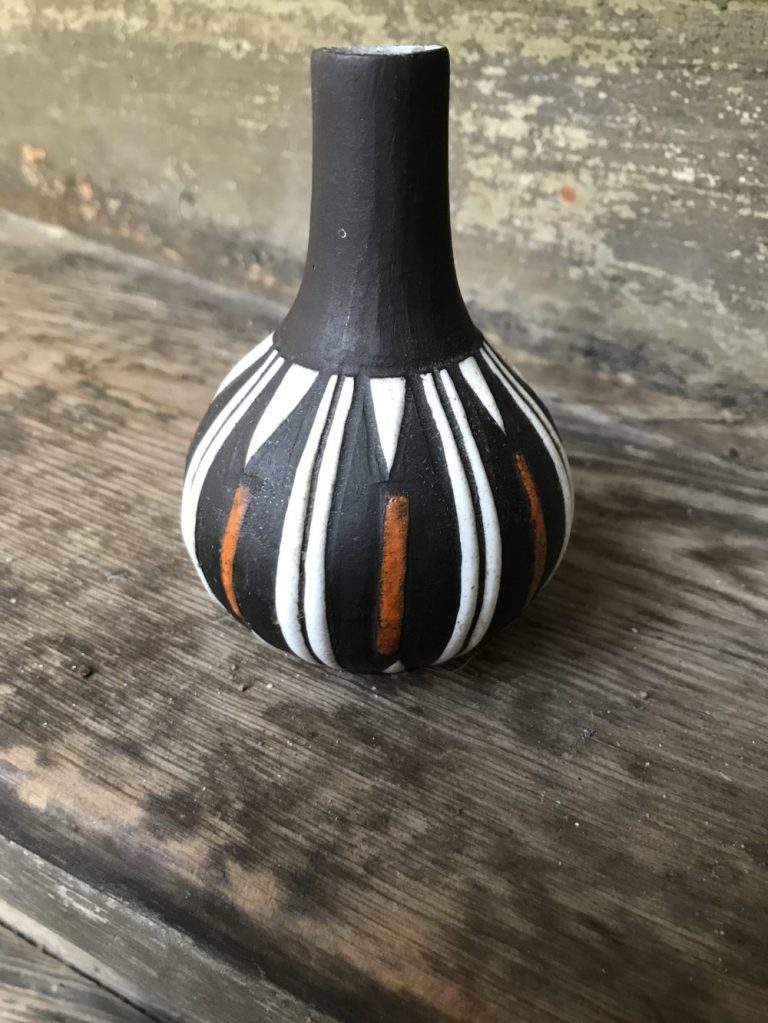
In addition to the strikingly bold, black and white designs there appear to be many variations of the series. Sometimes on the same forms, sometimes completely different forms.
Because there doesn’t seem to be much documentation about this series of designs – It is hard to know sometimes if pieces were designed as part of the Negro series, or simply colour variations added later due to its popularity which has continued to this day.
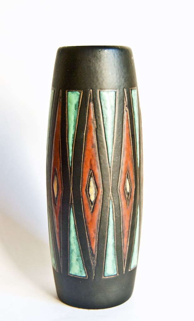
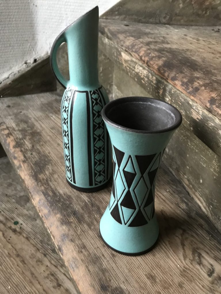
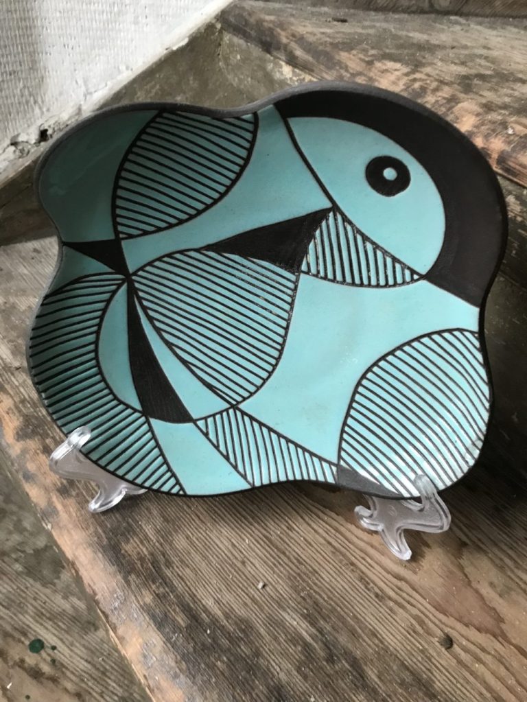
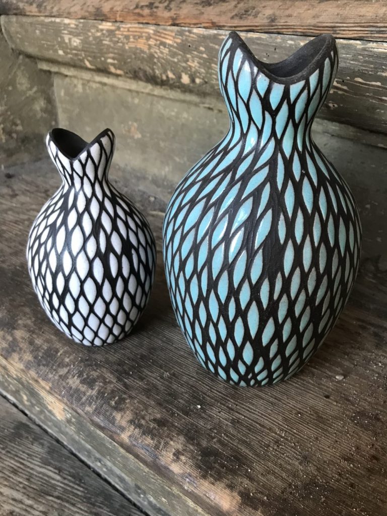
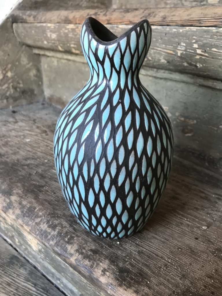
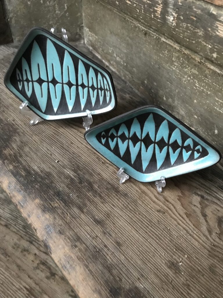
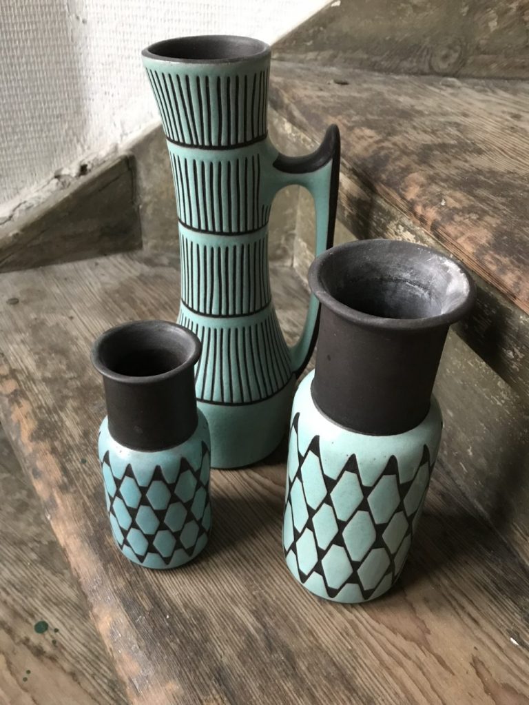
The red ochre, black and white variations seem to be more plentiful, but the turquoise and black designs very hard to find these days. The honey coloured and brown variations seem to be the hardest of all to locate.
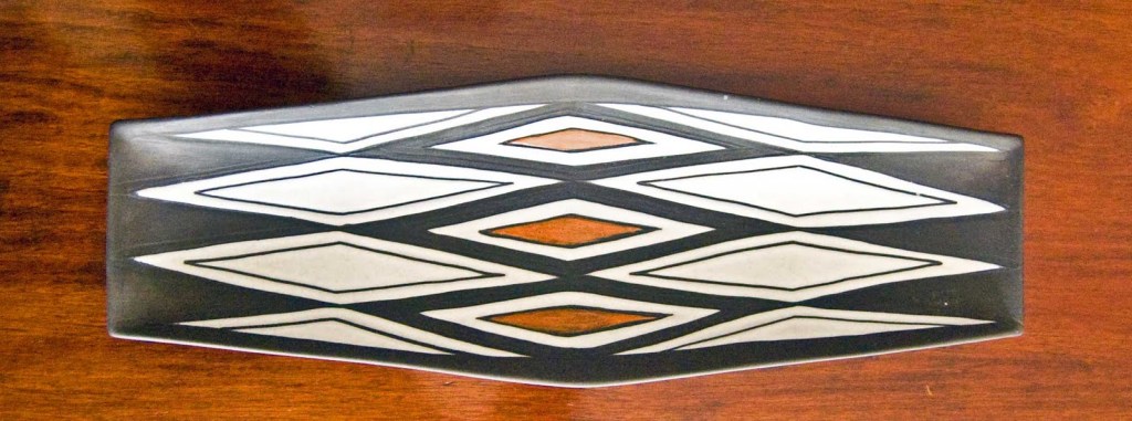
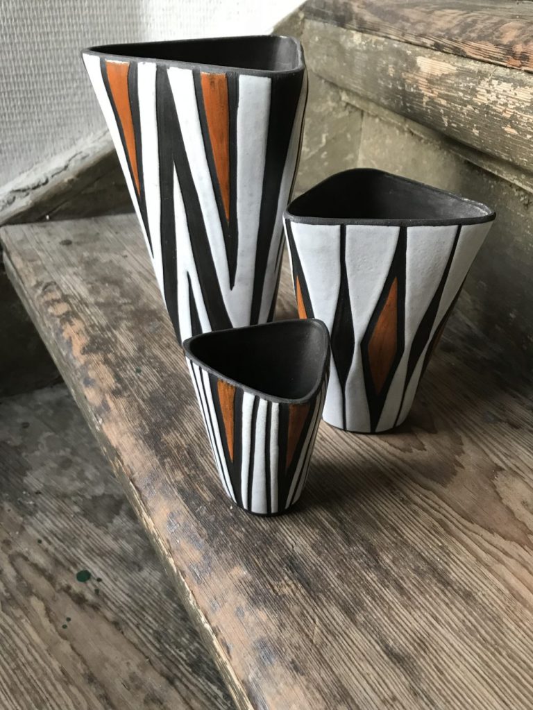
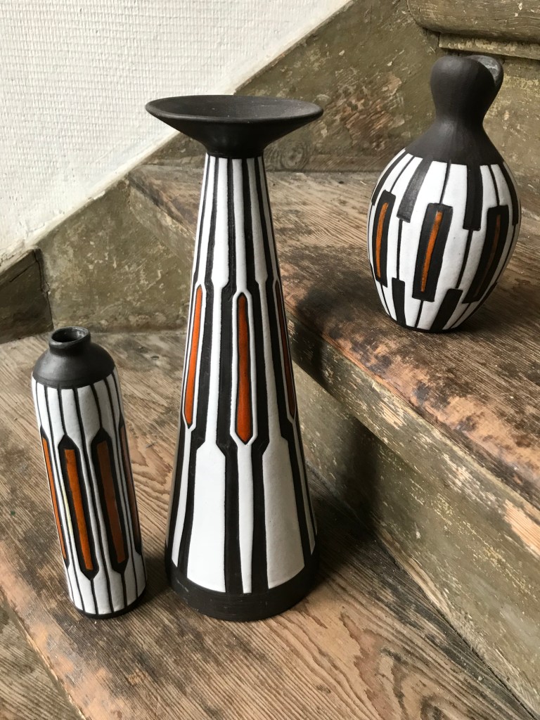
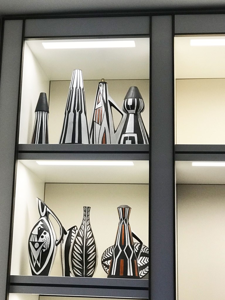
Large Negro Series Centrepiece Bowl, Black Red Ochre and White, MAS Denmark, photo Ray GarrodMAS Negro Series, Red Turquoise and Black Vase – Photo Ray Garrod MAS Negro Series, Red Ochre Black and White Design, Photo from Henrik, Denmark MAS Negro Series, Red Ochre Black and White Design, Photo from Henrik, Denmark MAS Negro Series, Red Ochre Black and White Design, Photo from Henrik, Denmark MAS Negro Series, Red Ochre Black and White Design, Photo from Henrik, Denmark Michael Andersen Denmark, Group of Marianne Starck Designs Including Negro and some of its variations, plus other designs with similar tribal style designs from the same era by Marianne. Photo from Henrik, Denmark. MAS Negro Series, Turquoise and Black Variation, Photo from Henrik, Denmark MAS Negro Series, Turquoise and Black Variation, Photo from Henrik, Denmark MAS Negro Series, Turquoise and Black Variation side by side with the same design in black and white, Photo from Henrik, Denmark In this image from the collection of Alan in the USA you can see 2 striking red ochre, black and white forms sitting with some of the stunning black and white forms.
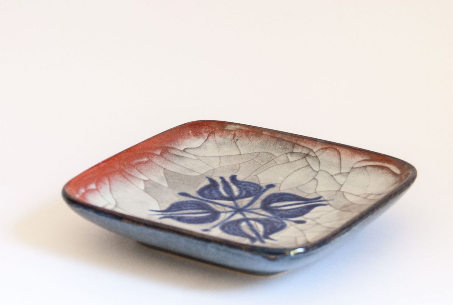
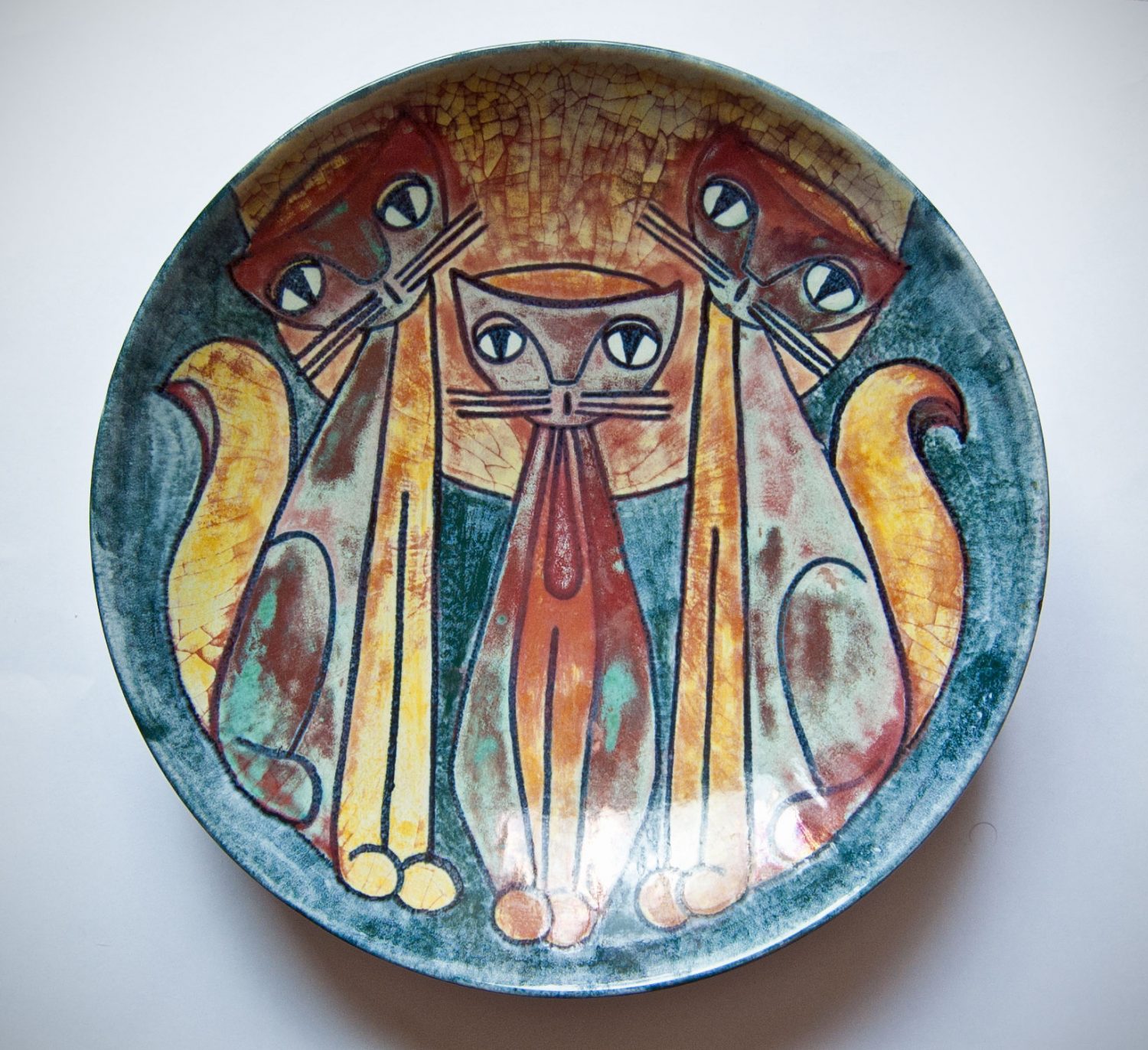
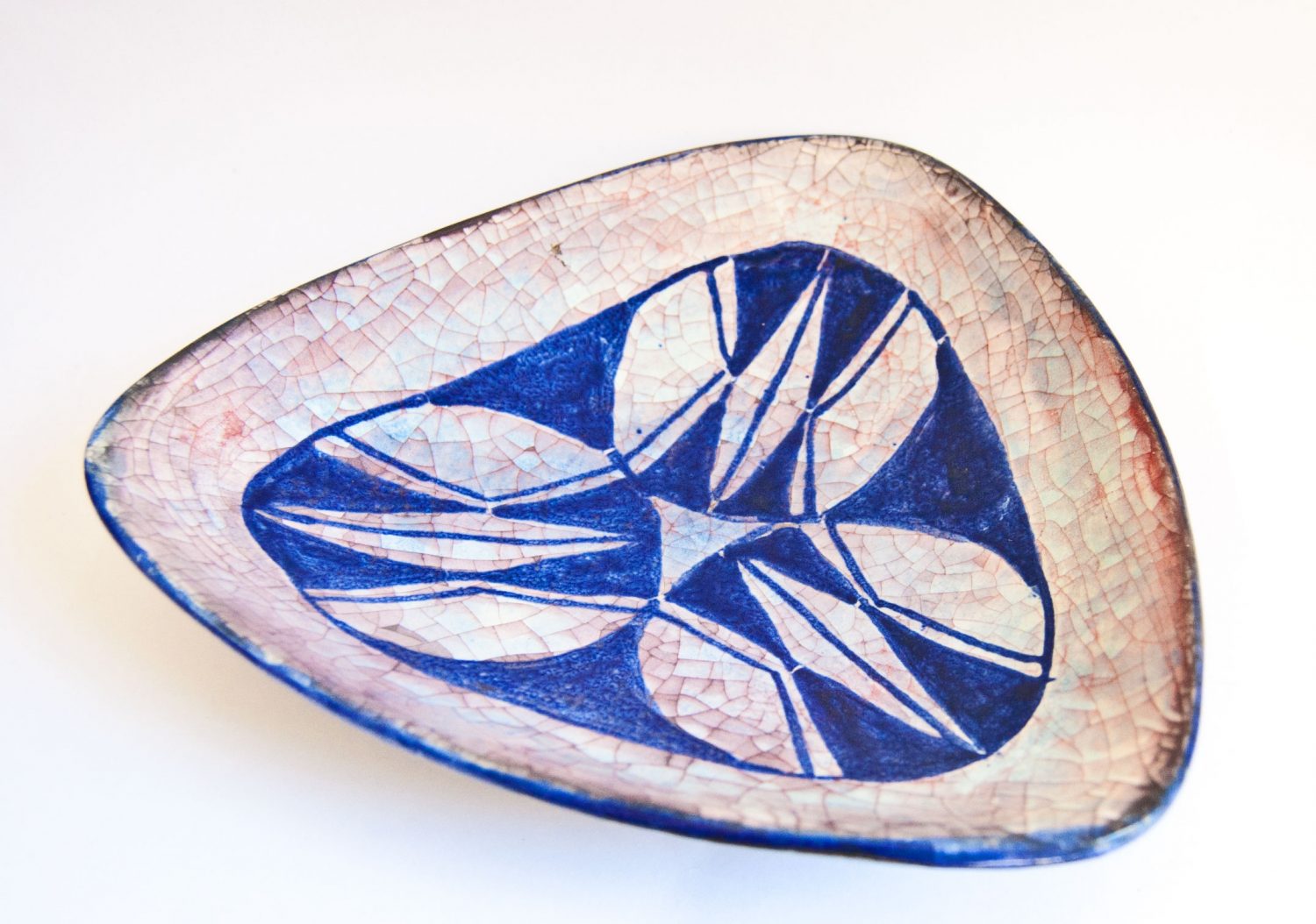
While the award winning and amazing “Persia” glaze at Michael Andersen & Sons was developed in the 1930s by Daniel Andersen (1885-1959) and used on pieces from that date, I think it is the designs of Marianne Starck at MAS & Sons in the 1950s and 1960s where the Persia glaze is seen at its best.
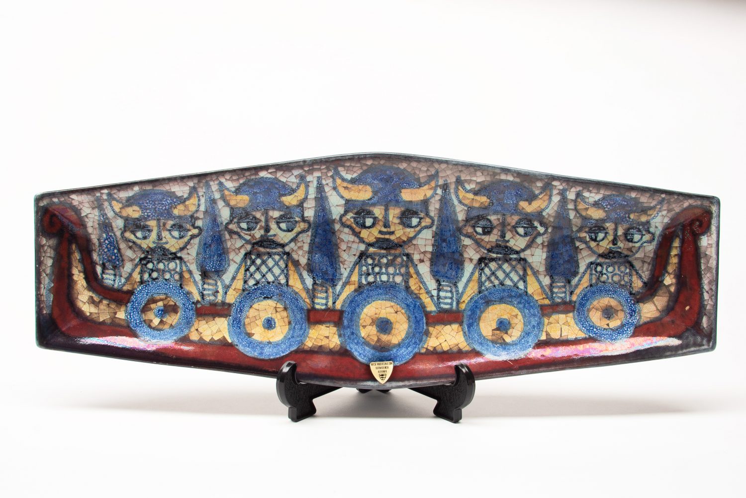
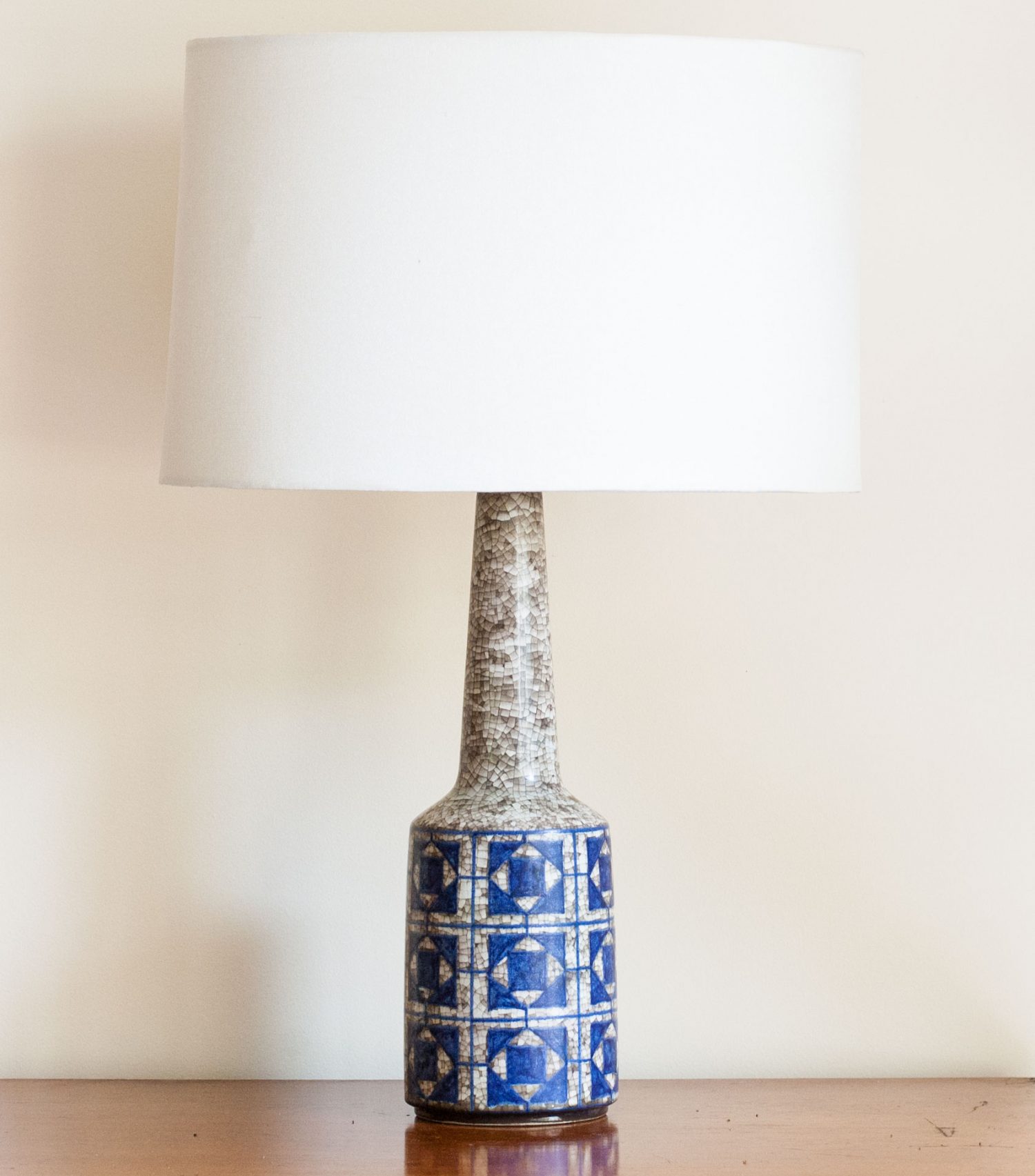
This complex glaze turns out differently on each piece, depending on the glaze colourants used and style of decoration. Sometimes it appears like a pearlescent multi coloured micro-mosaic, and at other times as a more subtle pattern decoration with grey pearlescent hues. Often the pieces using this glaze have beautiful but subtle oxidisation of the glaze, giving some of the colours a slightly metallic appearance – especially noticeable on the red colour of the Viking longboat in the first image below.
The glaze is also surprisingly smooth and silky to the touch. The Persia glaze was used on all types of forms – from utilitarian pieces to sculptural forms.
Below are some of my favourite pieces using the Persia glaze.
Michael Andersen Denmark, Persia Glaze Bowl, Marianne Starck – Photo Ray GarrodDetail – Viking Design on Michael Andersen Denmark, Persia Glaze Bowl, Marianne StarckMichael Andersen Denmark, Persia Glaze Lamp, Marianne Starck, Photo Ray GarrodMichael Andersen Denmark, Persia Glaze Bowl, Marianne Starck, Photo Ray GarrodMichael Andersen Denmark, Persia Glaze Dish, Marianne Starck, Photo Ray GarrodMichael Andersen Denmark, Persia Glaze Bowl, Marianne Starck – On this piece the Persia glaze effect is much more subtle, because of the large areas of colour in the design. Photo Ray GarrodMichael Andersen Denmark, Persia Glaze Dish, Marianne Starck, Photo Ray GarrodMichael Andersen Denmark, Persia Glaze Dish, Marianne Starck – Photo via DanishMood on EtsyMichael Andersen Denmark, Persia Glaze Mirror Frame, Marianne Starck – Photo via CopenhagenBlack on Etsy
The “Negro Series” sometimes referred to as the “Tribal” series was designed by Marianne Starck in the 1950s for Michael Andersen & Sons on the island of Bornholm, Denmark. You can read more about it in Part 1 HERE.
In addition to the strikingly bold, black and white designs there were some variations with this series. Because there doesn’t seem to be much documentation about this series of designs – It is hard to know sometimes if pieces were designed as part of the Negro series, or simply colour variations added later due to its popularity.
Also you will find that many of the shapes and forms used on the Negro series, were used for other designs coming out of the pottery during these mid-century years.
Henrik in Denmark, who is a passionate collector of the work of Marianne Starck has provided a number of photographs of part of his large and growing collection of Starck’s work for Michael Andersen – and in particular the large number of series which she designed during the 1950s including the “Negro” series.
Henrik has collected many pieces and variations of her designs which are very hard to find, and his collection goes to show us how prolific and original Marianne Starck was as a designer, in addition to being a skilled ceramicist.
Firstly, here are some of the less commonly seen black and white “Negro” series designs: (click on small images to bring up scrolling gallery).
Now some of the variations:
From what I can see the “Negro” variation most often seen, is the one with black and white + red ochre: The use of red ochre as an accent colour on these designs really makes them “pop”.
There is also another group which may or may not have beed designed as part of the original “Negro” series. It often has the same forms and designs often found on the Negro series, but has a black body with turquoise/green glaze. My favourite is the bold design bottom left.
Then there is another design, which also seems to be a variation of the Negro series motifs, featuring a black clay body, with red ochre+chrome green with no white.
OR If Etsy is unavailable, or you would prefer eBay - follow the link below (click on the image) . Basically the same items are listed, at the same price.